Registries
ActiveIcons/logos7,765

@lucide-animated

Icons/logos · MIT · data updated 2026-07-08

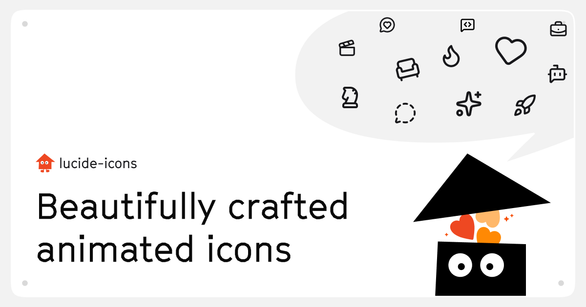
lucide-animated is a free, MIT-licensed open-source collection of 350+ smooth animated React icons built with Motion (formerly Framer Motion) and Lucide as the base SVG set. Every icon is a drop-in replacement for its static Lucide counterpart, adding entrance and hover animations. Installed via shadcn CLI. Copy-paste ownership model; 7,600+ GitHub stars. No paid tier. Use for: upgrading static Lucide icons to animated versions throughout a React UI without writing animation code, particularly effective on marketing sites or interactive dashboards where subtle motion adds polish.
Install

npx shadcn@latest add https://lucide-animated.com/r/registry.json

Health

StatusActive
Last commit1 week ago
LicenseMIT
Open issues12
ArchivedNo
Stars7,765

Components (440)

a-arrow-downa-arrow-upaccessibilityactivityair-ventairplanealarm-clockalign-centeralign-horizontalalign-verticalambulanceangryannoyedarchivearrow-big-down-dasharrow-big-downarrow-big-left-dasharrow-big-leftarrow-big-right-dasharrow-big-rightarrow-big-up-dasharrow-big-uparrow-down-0-1arrow-down-1-0arrow-down-a-zarrow-down-leftarrow-down-rightarrow-up-leftarrow-up-rightarrow-down-z-aarrow-downarrow-leftarrow-rightarrow-upat-signattach-fileaudio-linesbadge-alertbadge-percentbanbananabattery-fullbattery-lowbattery-mediumbellblocksbluetooth-connectedbluetooth-offbluetooth-searchingbluetoothboldbonebook-textbookmark-checkbookmark-minusbookmark-plusbookmark-xbookmarkbot-message-squarebot
Components: a-arrow-down, a-arrow-up, accessibility, activity, air-vent, airplane, alarm-clock, align-center, align-horizontal, align-vertical, ambulance, angry, annoyed, archive, arrow-big-down-dash, arrow-big-down, arrow-big-left-dash, arrow-big-left, arrow-big-right-dash, arrow-big-right, arrow-big-up-dash, arrow-big-up, arrow-down-0-1, arrow-down-1-0, arrow-down-a-z, arrow-down-left, arrow-down-right, arrow-up-left, arrow-up-right, arrow-down-z-a, arrow-down, arrow-left, arrow-right, arrow-up, at-sign, attach-file, audio-lines, badge-alert, badge-percent, ban, banana, battery-full, battery-low, battery-medium, bell, blocks, bluetooth-connected, bluetooth-off, bluetooth-searching, bluetooth, bold, bone, book-text, bookmark-check, bookmark-minus, bookmark-plus, bookmark-x, bookmark, bot-message-square, bot, boxes, brain, calendar-check-2, calendar-check, calendar-cog, calendar-days, cart, cast, cctv, chart-bar-decreasing, chart-bar-increasing, chart-column-decreasing, chart-column-increasing, chart-line, chart-no-axes-column-decreasing, chart-no-axes-column-increasing, chart-pie, chart-scatter, chart-spline, check-check, check, chevron-down, chevron-first, chevron-left, chevron-right, chevron-up, chevrons-down-up, chevrons-left-right, chevrons-right-left, chevrons-up-down, chrome, circle-check, circle-chevron-down, circle-chevron-left, circle-chevron-right, circle-chevron-up, circle-dashed, circle-dollar-sign, circle-help, clap

Preview

Live sandbox previews render component source client-side. Where a component can’t be rendered standalone, sh4dcn falls back to its source and install command.

@lucide-animated · a-arrow-down

npx shadcn@latest add https://lucide-animated.com/r/a-arrow-down.json
View source